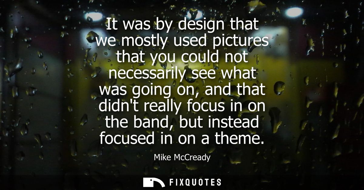
"It was by design that we mostly used pictures that you could not necessarily see what was going on, and that didn't really focus in on the band, but instead focused in on a theme"
About this Quote
The key phrase is “by design.” This isn’t accidental abstraction, it’s a controlled blur. That blur does two things at once: it protects the music from being flattened into branding, and it invites projection. When the subject is partially obscured, the viewer supplies meaning, and that meaning tends to rhyme with whatever the songs are already stirring up. You’re not watching Pearl Jam; you’re wrestling with the theme.
It also reads like a quiet manifesto against the typical marketing logic of rock imagery. Most bands sell access: intimacy, recognizability, the promise that the poster is a proxy for presence. McCready’s approach sells distance, even discomfort. That fits a broader 90s-alt ethos where authenticity was performed through refusal - refusing polish, refusing spectacle, refusing to let the audience have a neat, idol-ready product.
The subtext is control without domination: steer attention, but don’t dictate interpretation. Make the visuals less like advertisements and more like companions to the record’s interior weather.
Quote Details
| Topic | Music |
|---|---|
| Source | Help us find the source |
| Cite |
Citation Formats
APA Style (7th ed.)
McCready, Mike. (2026, January 16). It was by design that we mostly used pictures that you could not necessarily see what was going on, and that didn't really focus in on the band, but instead focused in on a theme. FixQuotes. https://fixquotes.com/quotes/it-was-by-design-that-we-mostly-used-pictures-97495/
Chicago Style
McCready, Mike. "It was by design that we mostly used pictures that you could not necessarily see what was going on, and that didn't really focus in on the band, but instead focused in on a theme." FixQuotes. January 16, 2026. https://fixquotes.com/quotes/it-was-by-design-that-we-mostly-used-pictures-97495/.
MLA Style (9th ed.)
"It was by design that we mostly used pictures that you could not necessarily see what was going on, and that didn't really focus in on the band, but instead focused in on a theme." FixQuotes, 16 Jan. 2026, https://fixquotes.com/quotes/it-was-by-design-that-we-mostly-used-pictures-97495/. Accessed 14 Mar. 2026.


